The Challenge
The pressing need for analytics solutions arose before PwC could establish a global standard, resulting in significant diversity in product selection and data visualization design across teams. This divergence was compounded by numerous cases of graph misuse, leading to a complex landscape of inconsistent practices. The absence of a unified approach not only hindered seamless collaboration but also underscored the urgency for a cohesive solution that would align teams and enhance overall effectiveness.
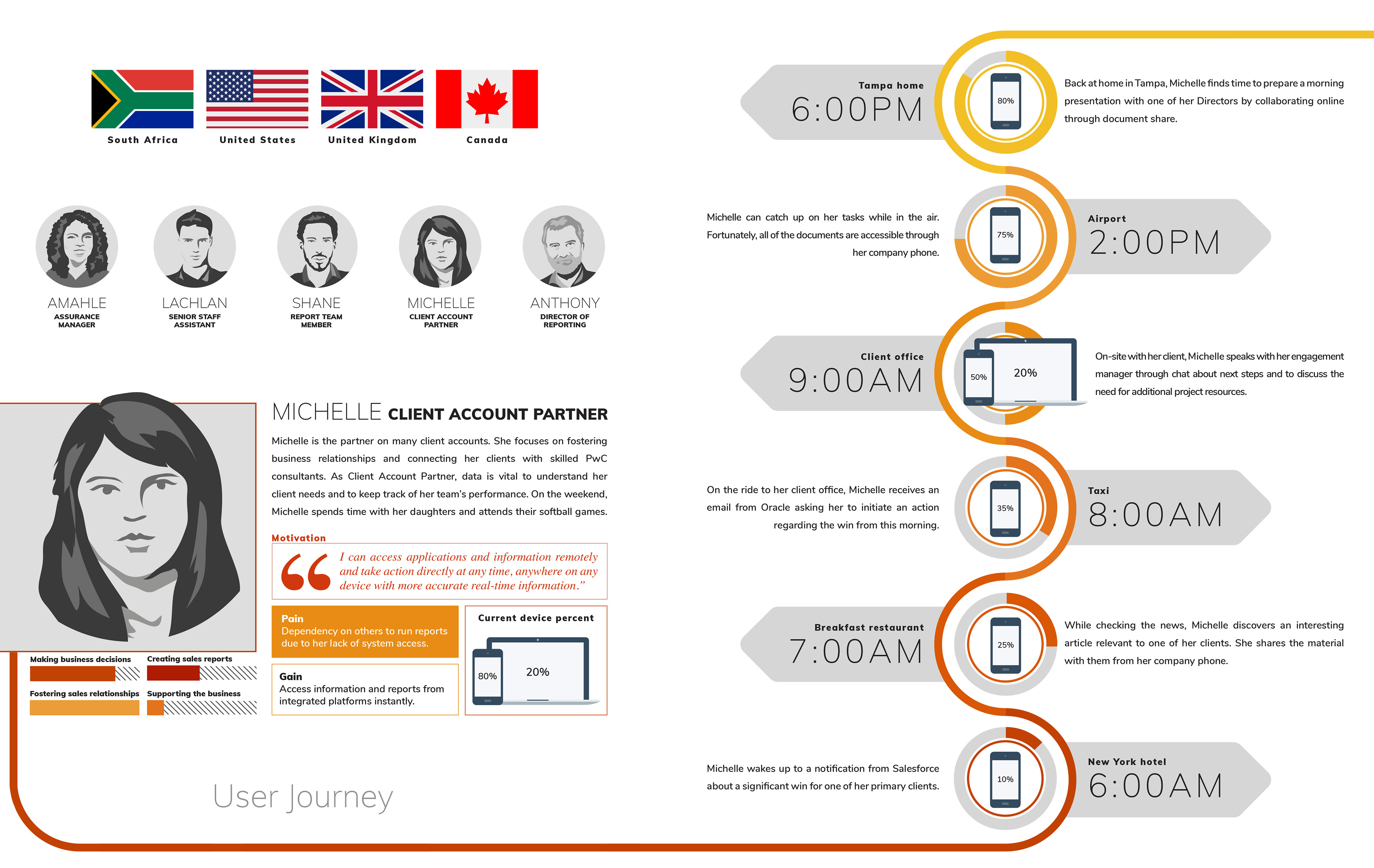
Global Insights: User-Centric Research Informing Archetypes and Journeys
Unveiling a wealth of global insights, our user-centric research has played a pivotal role in shaping archetypes and journeys. Through a meticulous exploration of diverse user experiences from around the world, we've gained a comprehensive understanding of motivations and challenges. These insights have acted as the bedrock for the creation of targeted archetypes, representing the diverse range of users and their distinct needs. As we construct corresponding customer journeys, we weave these insights into narratives that resonate with users' preferred future states. This amalgamation of global insights, archetypes, and journeys ensures that our design decisions are rooted in empathy, delivering solutions that genuinely enhance user experiences across cultures and contexts.
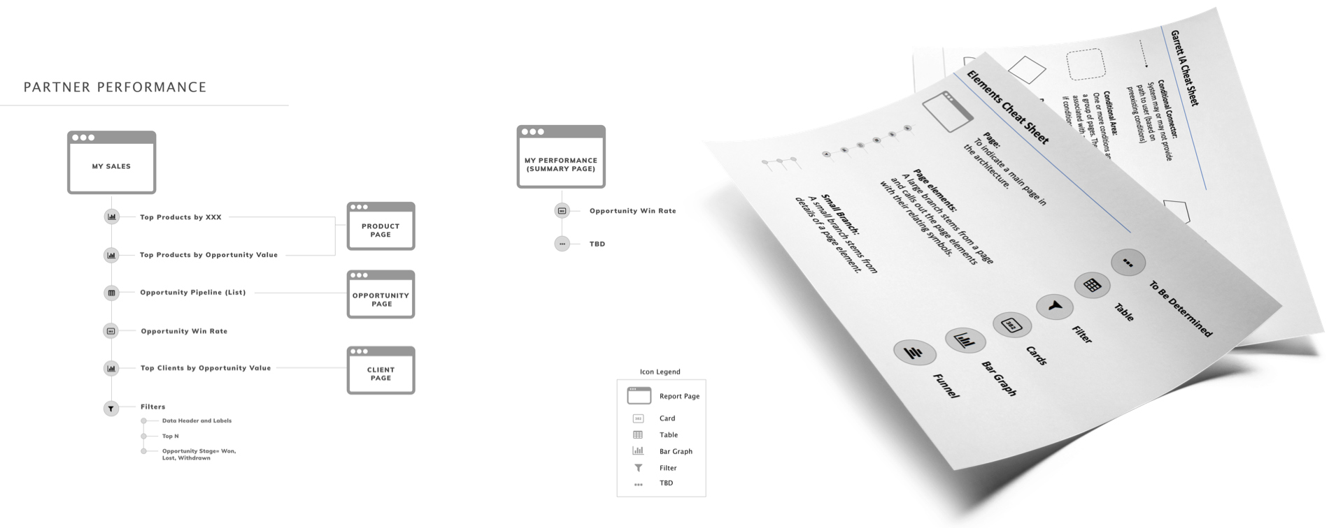
Structuring User Paths: Crafting Consistent Architectures for Effective Design
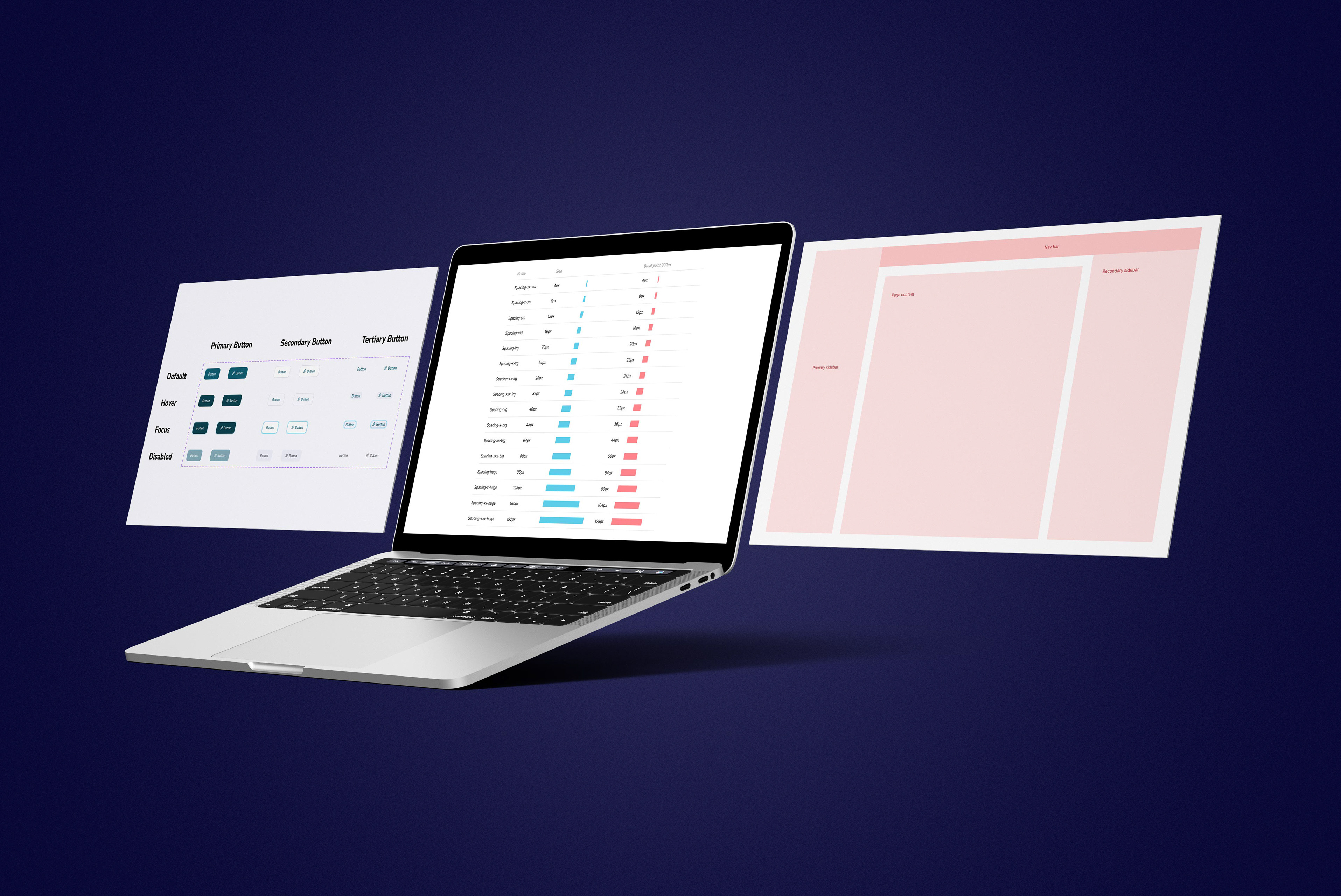
Drawing inspiration from the Garrett IA cheatsheet, we've woven together a tailored data visualization architecture unique to our context at PwC. This structured approach forms a backbone for our design endeavors, fostering clarity and cohesion in user interactions. These architectures have been distilled into editable templates, available in formats like Microsoft PowerPoint and Google Slides. This approach empowers teams to create purposeful and engaging designs, ensuring that each user's journey unfolds coherently and effectively.
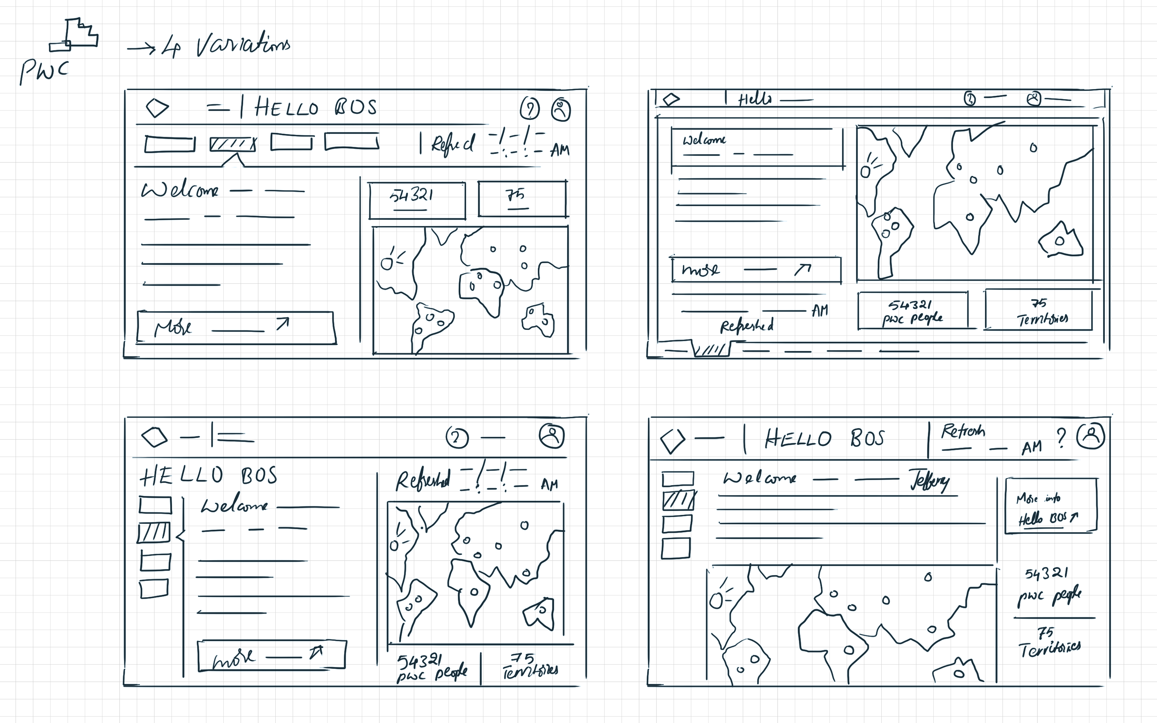
Sketching the Design Landscape: A Prelude to Figma Exploration
Prior to immersing myself in Figma, I initiated the design process by crafting a sequence of sketches. These sketches play a crucial role in assessing various states of the UI features, offering a thorough exploration and comprehension of design variations before progressing to the digital design phase within Figma.
Agile Design Exploration: Empowering Iterations with Power BI Ideation
Embracing an agile approach to design, Power BI ideation has emerged as a catalyst for iterative enhancement. By engaging directly within the Power BI platform, our team gains the power to swiftly iterate and evolve designs. This methodology empowers us to fine-tune details, experiment with features, and seamlessly adjust layouts based on real-time insights. Through this dynamic process, we ensure that our designs are not only visually engaging but also optimized for functionality and user experience. Power BI's versatility serves as a valuable canvas for creative experimentation and quick adaptation, resulting in refined and impactful design solutions.
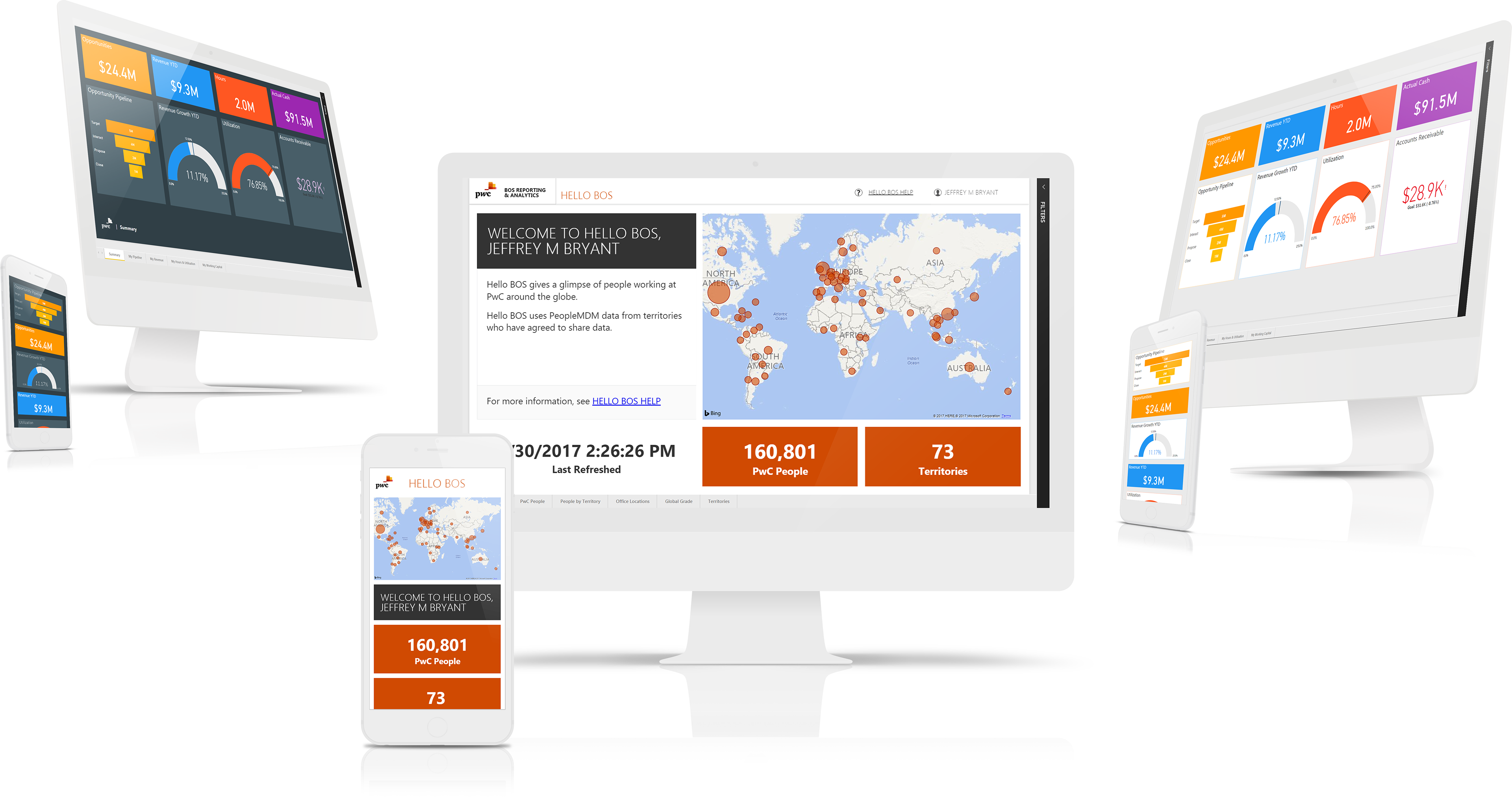
Innovative Prototyping: Addressing Power BI's User Experience Challenges
In the realm of user experience enhancement, innovative prototyping has emerged as a key strategy in tackling Power BI's challenges. By leveraging prototyping techniques directly within the Power BI environment, we've gained a powerful tool to dissect and address the platform's less intuitive elements. This approach allows us to simulate user interactions and gather invaluable insights into usability hurdles that users might encounter. Collaborating with both user feedback and Microsoft's expertise, we're able to devise effective solutions that enhance the overall user experience.
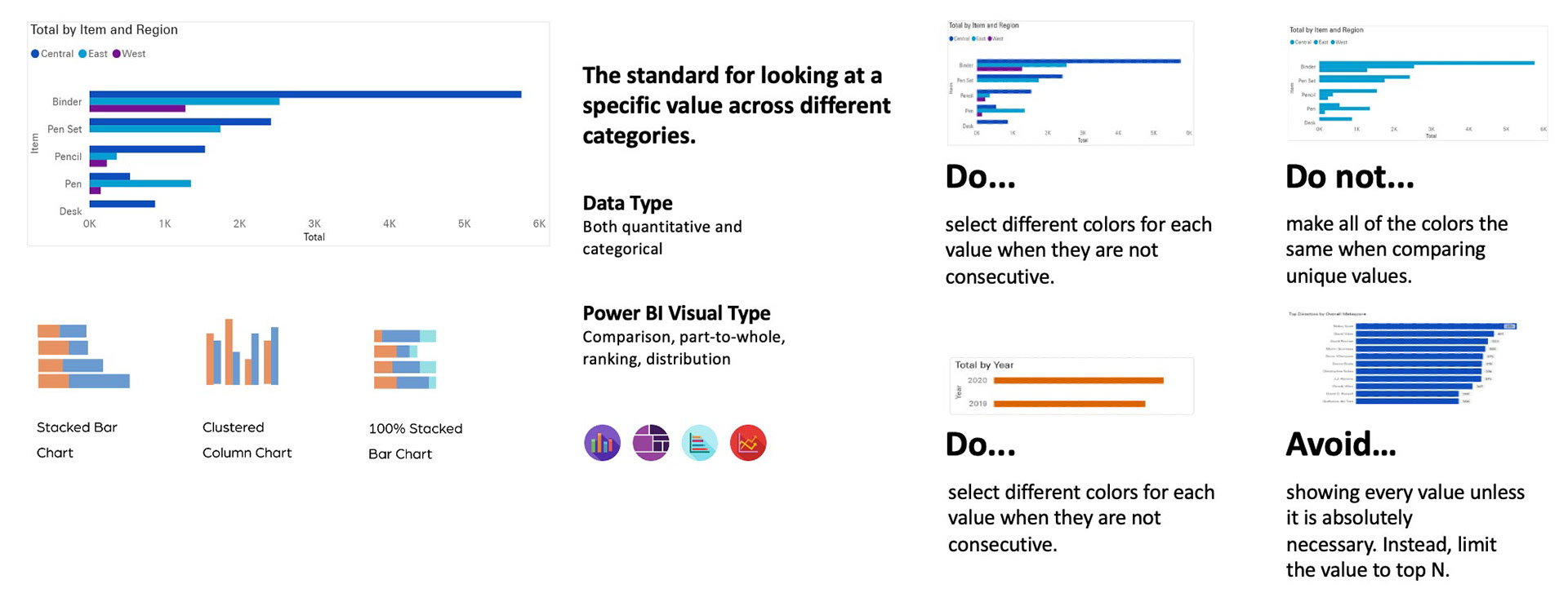
Graph Usage Clarity: Crafting a Comprehensive Style Guide for Effective Communication
In the pursuit of clear and effective data communication, our focus on graph usage clarity has led to the creation of a comprehensive style guide. This guide goes beyond colors and typography, encompassing a holistic approach that ensures coherent and impactful communication through graphs. Each graph type receives dedicated attention, from layout suggestions to narrative tips, aimed at enhancing the understanding of complex data. By offering a unified language for graph design, our style guide empowers teams to convey insights seamlessly and consistently.
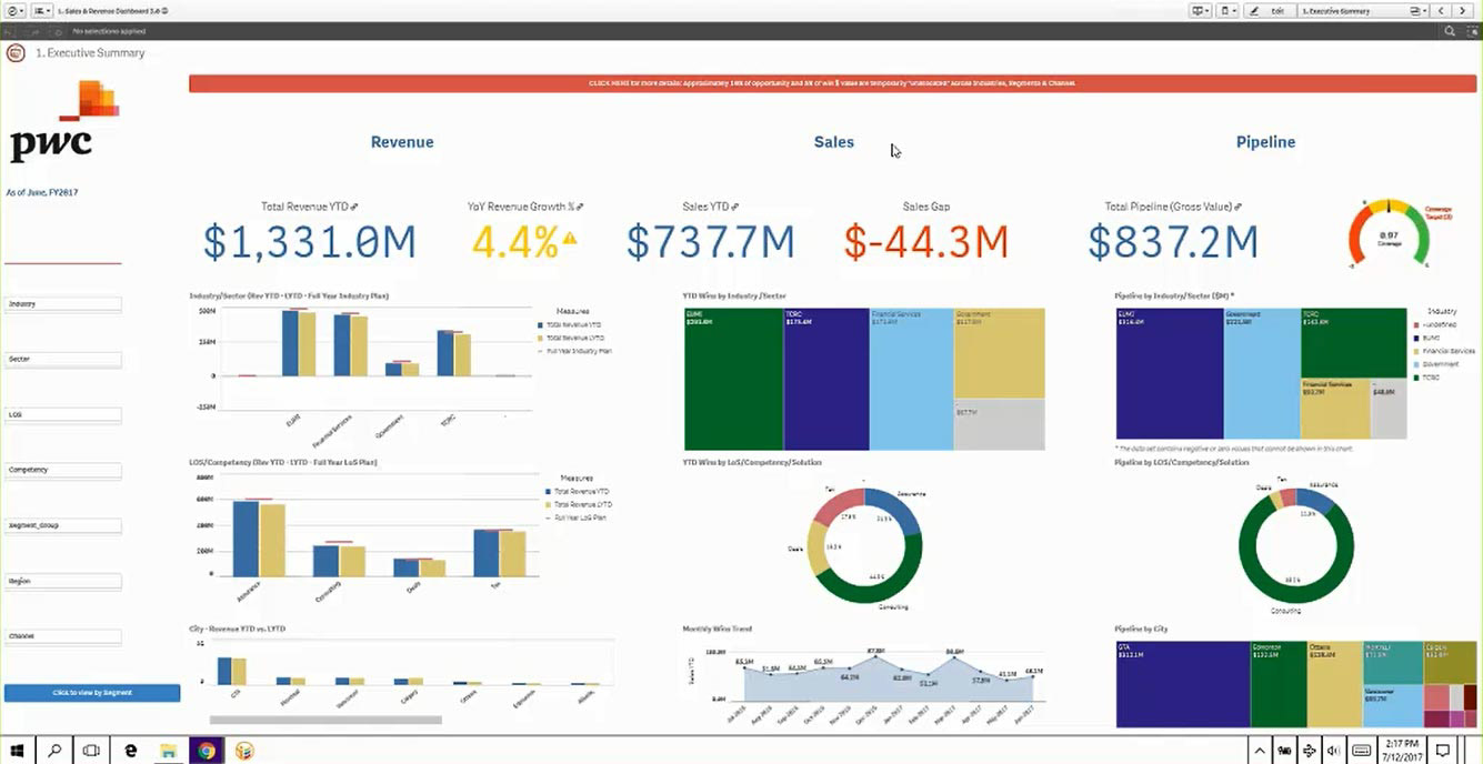
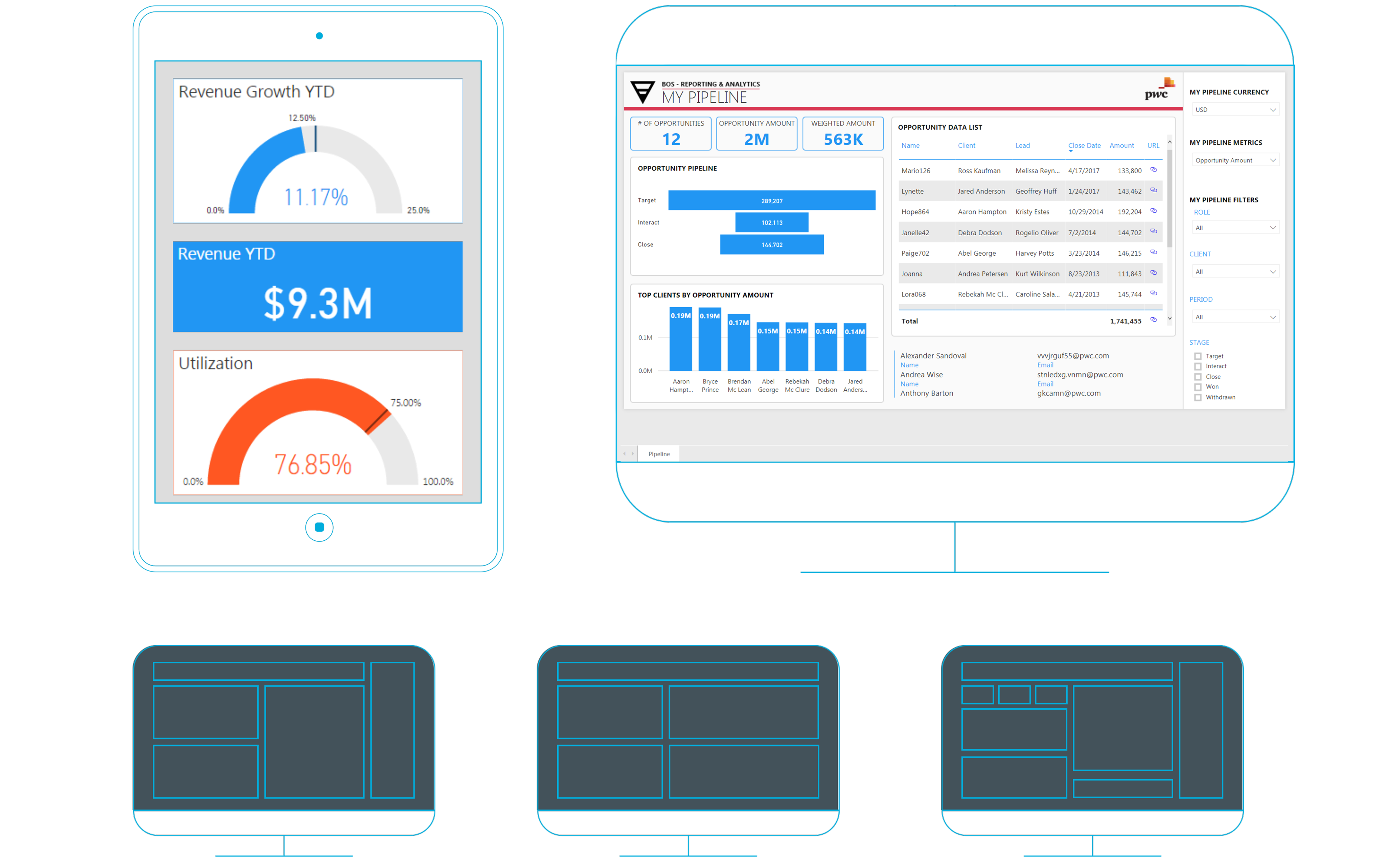
Enhancing Layouts: Power BI Templates for Distinctive Reporting
Elevating the realm of reporting, our focus on enhancing layouts has materialized in the creation of tailored Power BI templates. These templates serve as dynamic frameworks that go beyond mere aesthetics, offering a structured foundation for distinctive reporting. By crafting templates directly within Power BI, we enable teams to efficiently establish consistent and visually appealing reporting structures. These templates delineate the differentiation between various types of reports, such as finance reports and executive dashboards, ensuring a coherent and professional presentation of data. This approach not only expedites the reporting process but also empowers teams to deliver impactful insights through intuitive layouts that resonate with their intended audience.
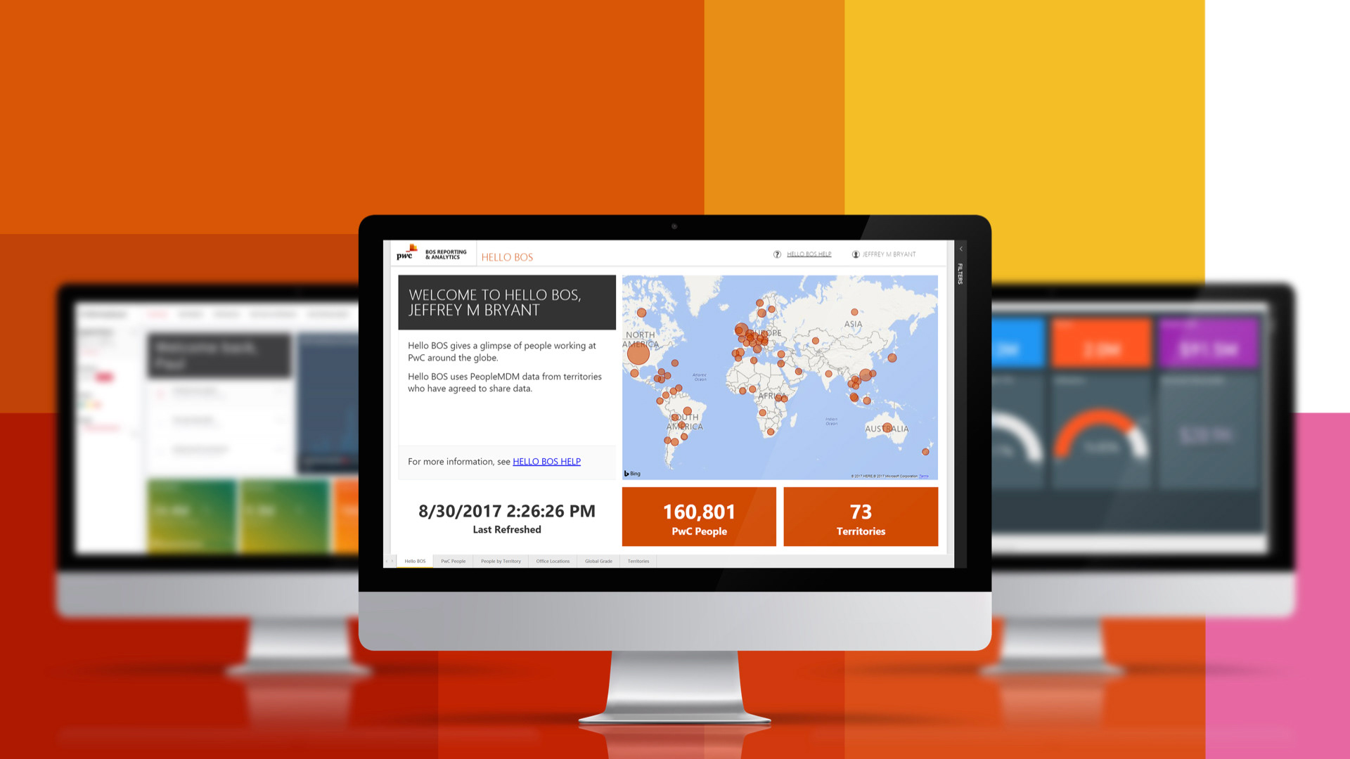
Empowering Mastery: Global Education on Power BI Dashboards through Omnichannel Strategy
PricewaterhouseCoopers operates 800 offices in 157 countries, each with unique data analytics requirements. Consequently, numerous teams developed ad hoc solutions to address immediate data needs. Over 5 months, I spearheaded a worldwide endeavor to consolidate these teams through a uniform design standard. This involved crafting a data visualization style guide, designing templates, and producing instructional videos.