Crafting a Design System
A design system is a collection of reusable components, guided by clear standards, that can be assembled together to build any number of applications. A design system ensures that all elements across different products or parts of an application look cohesive. This includes typography, color schemes, spacing, and component design. With a library of pre-designed components and guidelines, designers and developers can quickly assemble new pages and features without having to design each element from scratch. This significantly reduces design and development time.
The Challenge
Building a design system involves several complex challenges, spanning organizational, technical, and operational aspects. Securing consensus among diverse stakeholders—including designers, developers, product managers, and executives—is crucial. Each group has unique priorities and perspectives, making unified agreement challenging. Also, establishing the boundaries of the design system—what components and guidelines to include—is critical. An overly ambitious scope can render the system unmanageable, while a limited scope might not provide sufficient value.
Application components
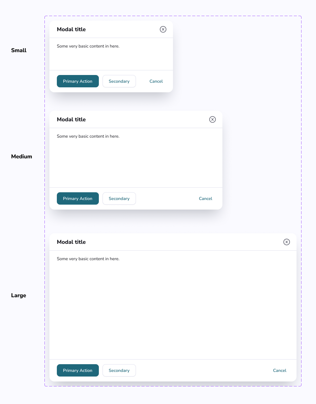
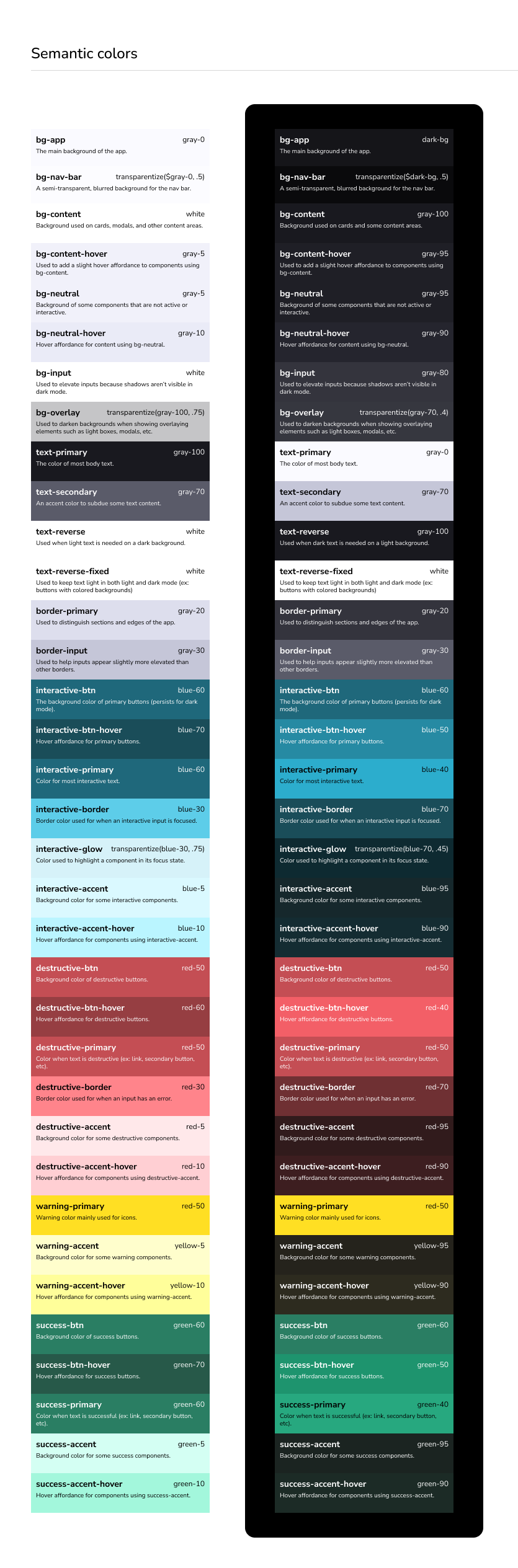
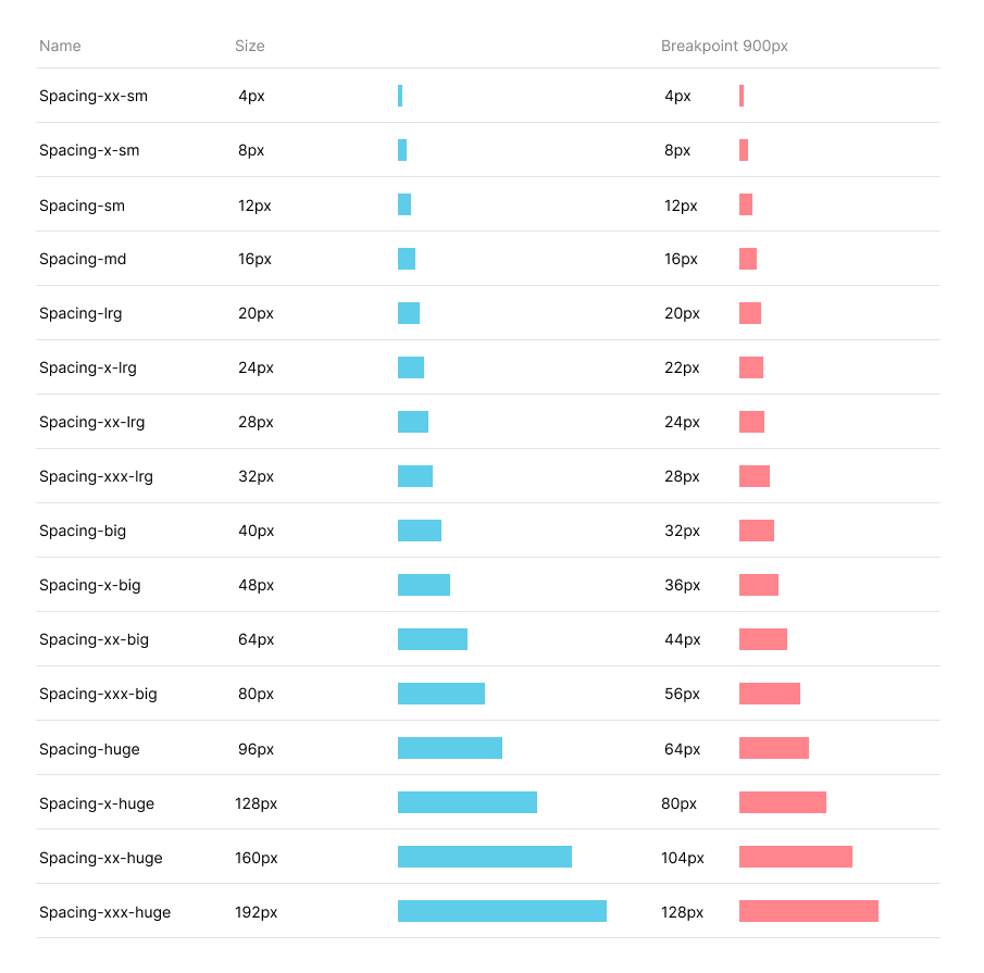
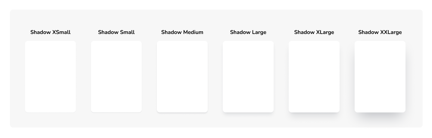
A design system is composed of various types of components that collectively ensure consistency, efficiency, and quality in the design and development of applications. Basic elements are the foundational building blocks, such as buttons, input fields, checkboxes, radio buttons, sliders, and toggles. They are designed to be reusable and consistent across the application.

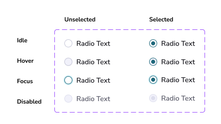
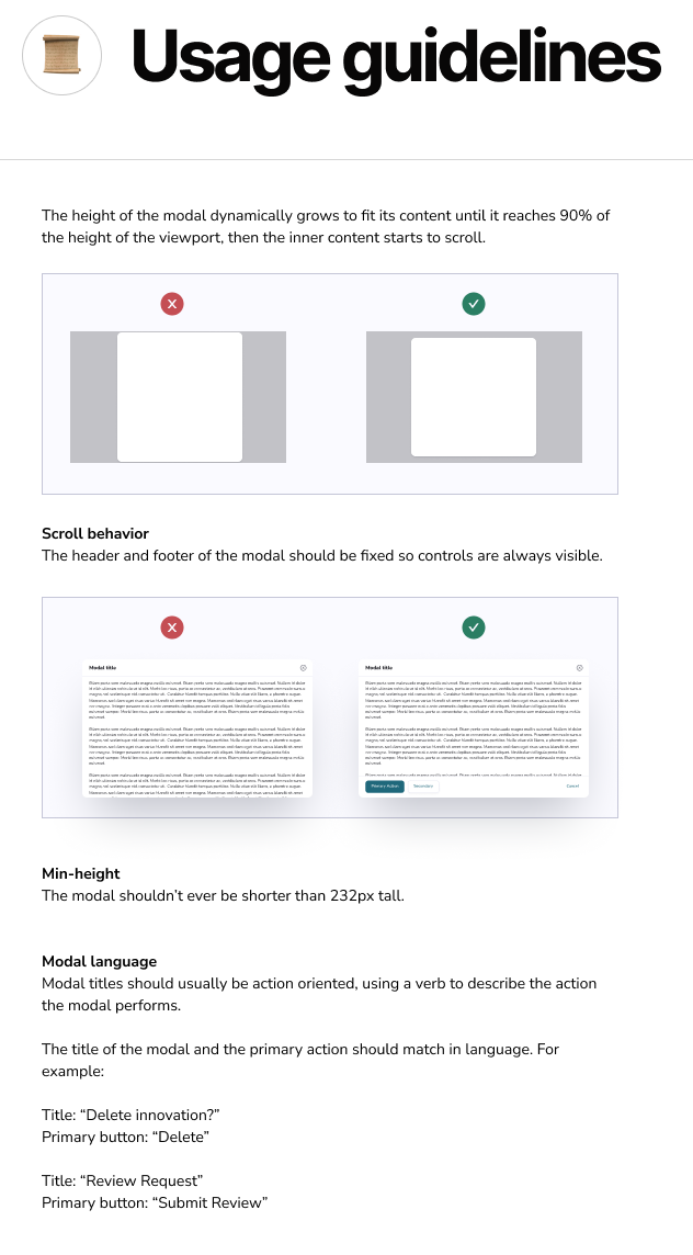
Essential Usage Guidelines
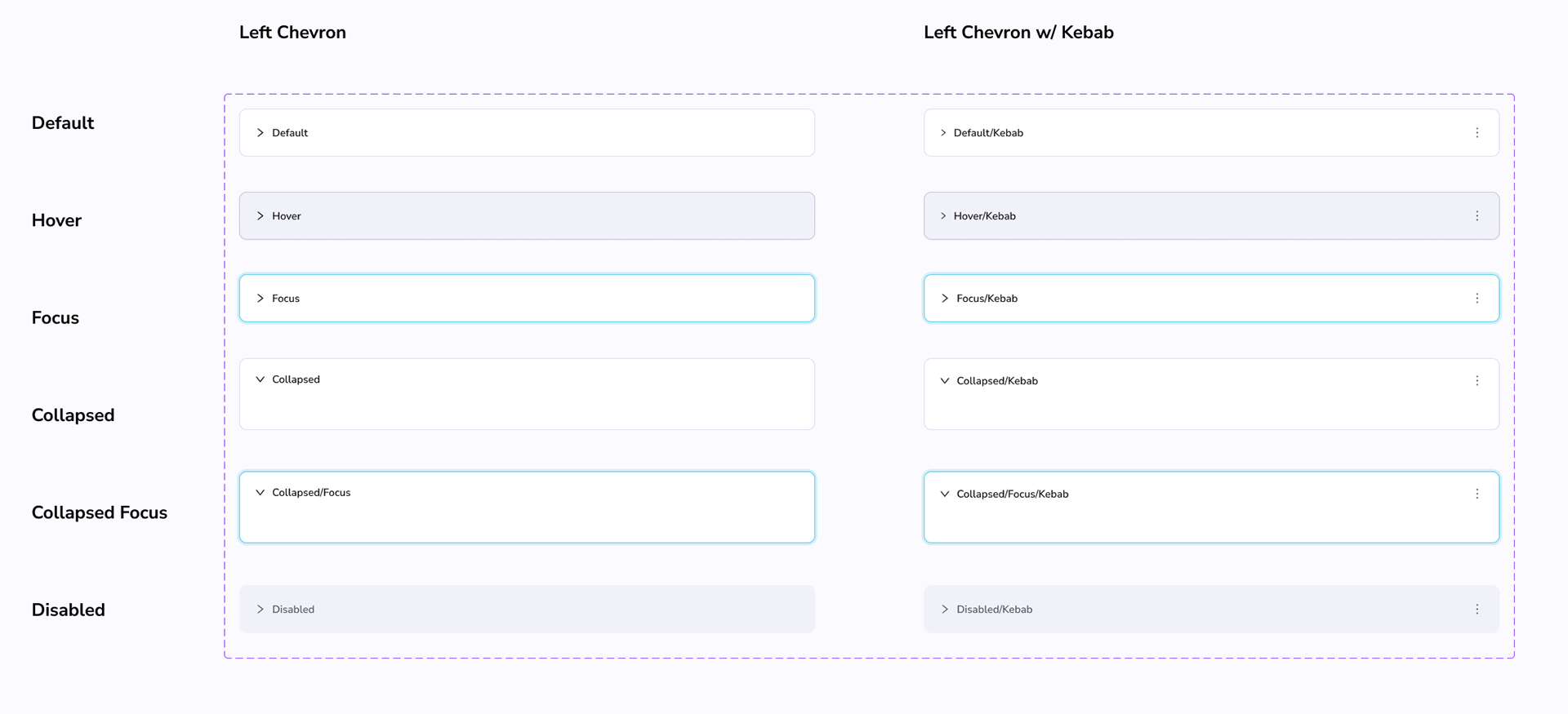
For each component, a detailed usage guide is essential. This guide should clearly outline the best practices and common pitfalls, providing comprehensive instructions on how to effectively utilize the component within the design system.